Showing posts with label Art. Show all posts

Wednesday, February 19, 2025

‘Mysterious Images’: An Exhibition of Trompe L’oeil

It is my habit to rummage in bookshops and flea markets in boxes of booklets and pamphlets. I like monographs on ancient monuments or obscure subjects, old town guides, programmes for forgotten festivals, and unexpected ephemera, the passing moments of the printed word.

It was in this way I came upon a catalogue for an exhibition devoted to the art of Trompe L’oeil from the XVIIIth century to the present day held seventy years ago at Arthur Jeffress (Pictures) of Davies Street, London W1, from 18 January-19 February 1955. Sixty one pieces were on display. The gallery had opened in 1954, so this exhibition would have been one of its earliest.

The cover design, signed by A. Groves Raines, depicts a surreal miscellany of eyeglasses, eyeballs, a green lamp and pieces of paper on a wooden shelf against a canvas background. This artist does not seem to be otherwise much known.

An introduction by the artist and art critic Robin Ironside is cool and crisp. He defends the technique: ‘The beauties of trompe l’oeil painting are seldom acknowledged by earnest minded critics without some form of introductory apologia. Though such caution may be explained, it could hardly be more misplaced.’ It may in fact be an intriguing art: ‘The contents of the cabinet, the book shelf or the letter rack are potentially rich in revealing or mysterious images and lend themselves to a diversity of elegant arrangements’; further, ‘the contents of a modern medicine cabinet, selected with imagination, might prove to be more wonderfully grotesque than anything in the curio cabinets of the seventeenth century.’

One of the qualities of trompe l’oeil is that it may sometimes seem a keen metaphor for the world we think of as real, prompting the idea that what we see is also an artifice and that there are further, stranger realms beyond, a view shared by Machen, de la Mare and Mary Butts among others in the field of fantastic literature. For some time I mulled over the notion of using the catalogue as a stepping-off point for a story along just those lines, but it has never quite cohered. 

I leafed through the descriptions of the exhibits and the occasional illustrations. Some phrases caught my attention. The catalogue listed a 1778 work by one ‘John Mallacott’, entitled ‘Where Shall Celia Fly For Shelter?’, which seems to have been a contemporary song: but I could find no further record either of the painter or the painting. The same was true for several of the earlier pieces. They seem to have disappeared.

Whoever possessed the catalogue has made a few pencil annotations. They wrote the date in pencil on the front cover, January 1955, and on an inner page the enigmatic note ‘suede shoes/black duffel’. This sounds like a brief note about someone they were to meet or who interested them there, perhaps the description of another visitor to the gallery. Boy or girl? By the Fifties, these items might be worn by either. Who were they? Did the two make contact? What, if anything, transpired?

The titles of some of the pictures make us wonder what they looked like, from Martin Battersby’s ‘Cup of Tea’, ‘Shuttlecock’, ‘Key’ and ‘Gauloise Bleue’ to ‘Torn Papers’ (Chinese School), ‘Riddle-me-Ree’ (English School, Early 19th Century), ‘The Bibliophile’s Firescreen’ (Varnished Watercolour laid on wood), and ‘A Portrait with Broken Glass’ (French School, 18th Century). Each image suggests a story of some sort.

There were three watercolours by Richard Chopping, ‘Pansies and Snails’, ‘Pears and Still Life’ and ‘Globe Artichokes’. He was soon to become known for his dustjacket designs for Ian Fleming’s James Bond novels, some of which use elements of trompe l’oeil too.

There was also one piece in egg tempera by Eliot Hodgkin, ‘Flint and Egg Shells’. He was notable for his keenly observed, highly naturalistic work. I liked this quotation from him in The Studio, 1957: ‘In so far as I have any conscious purpose, it is to show the beauty of natural objects which are normally thought uninteresting or even unattractive: such things as Brussels sprouts, turnips, onions, pebbles and flints, bulbs, dead leaves, bleached vertebrae, an old boot cast up by the tide. People sometimes tell me that they had never really ‘seen’ something before I painted it, and I should like to believe this . . .  I try to show things exactly as they are, yet with some of their mystery and poetry, and as though seen for the first time . . .’

Our visitor has bracketed the four contemporary pieces by L. Roy Hobdell, ‘Pompom Rouge’, ‘Erotica Romana’, ‘Gothick’ and ‘The Clove Ball’, and written ‘poor’: but Peter Stebbing’s ‘Camellias’ and Timothy Whidborne’s ‘Still Life’ are noted as ‘good’, the latter with the question ‘date?’

Most of the contemporary artists exhibited here went on to have careers which continued to involve aspects of trompe l’oeil, for example in murals, theatre design, still lives and commercial art (posters, packets and boxes). I enjoyed the oddities and mysteries that the catalogue suggested and have often wondered about the individual pieces of art, the visitor with the pencil, and his suede-shoed, duffel-coated stranger.

(Mark Valentine)


Saturday, April 30, 2022

The Shipley Canal Fantasy Mural

Anyone walking along the canal towpath from the Victorian model village of Saltaire to the neighbouring town of Shipley will soon come across an unusual sight. 

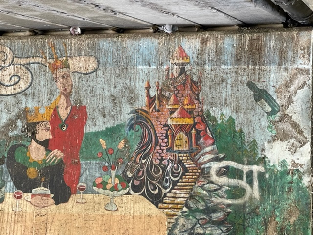
Under a gloomy tunnel at Fox Corner, with pigeons nesting in the eaves, mellifluously cooing to each other, there is a colourful mural full of fantasy motifs - a jester, a dragon, a fairy-tale castle, courtly ladies, a knight, a tree-woman. 

It looks for all the world like the album cover for a 1970s progressive rock LP, or the design for a Pan Ballantine Adult Fantasy paperback. We wondered when we first saw it if it indeed dated from those heady times.

There isn't all that much about it online but one of the five participating artists, Dave Cogan, has posted a couple of comments (scroll down the link to see this one) which explain the background. He recalls that it was a project in February 1993 led by mural artist Tom Cousins.

The latter's website explains that he once lived and worked in Bradford (the nearest city to Shipley) and did other murals there, but is now based in the Forest of Dean, Gloucestershire, still creating murals. 

Tom had got permission from the waterways board, and a local firm provided the paints, but even so there was some opposition from councillors and the press. Despite that, the mural is now one of the sights of the canal walk and, as Dave Cogan says, certainly brightens up a rather grim, dingy tunnel. 

The mural is in a fairly inaccessible position and this has probably helped save it not only from busybody killjoys but also from the depredations of the elements, and from the attentions of urban graffiti artists, although a few tags have been added on top of one or two of the scenes.

It is just the sort of eccentric, fanciful, delightful, bizarre and cheering public art that ought to be cherished and preserved. 

(Mark Valentine: Photographs: Jo Valentine)


Thursday, March 11, 2021

'Colour' Magazine (1914-1932)

Lost artists are often harder to discover than lost authors. At least with the latter their books can still be found, even if it sometimes takes a lot of looking. But an obscure artist’s work often disappears, unless it is recorded in an exhibition catalogue or monograph. You may come across a piece you admire in a periodical and want to find out more but art, unlike books, has no comprehensive catalogue such as at the British Library, so you are reliant on chance mentions in reviews, sales rooms, memoirs and so on.

The monthly art magazine Colour ran from 1914-1932. It seems to have been relaunched, keeping the same name but beginning the numbering again with Vol 1 No 1, from November 1928. I do not know whether there was any break in publication before this relaunch.  It included short stories, essays and a few poems, but its main feature was reproductions in colour and black & white of work by contemporary artists, unrelated to the literary content.

Unlike other art illustrated magazines of the time, such as Studio, Colour rarely used old masters or classic works.  It seems to have been open to most styles among contemporary artists, including the newest, and because it was much more long-running than the typical avant-garde periodical such as Blast! or Ray, which came out in only a few issues, it is a valuable source for the art scene of the period.

A copy for June 1915 which I have includes notable pictures by the aesthetes Charles Ricketts and Charles Shannon, a short story by E C Vivian, ‘Together’, (“Harrison got up out of his coffin and looked around . . .”), an essay, ‘An Impression of Macao: The City of Dreams’ (“I love this sleepy, old-world island dearly”) by Gerald Hamilton and several other stories and essays.

There are also two pictures by artists I did not know and who do not seem to be well-known, but whose work looks of particular interest for connoisseurs of the fantastic and grotesque. The impression of Prospero by E.A. Cox seems to me powerful.  He must be Elijah Arnold Cox (1876-1955), who is briefly noted in online sources as providing artwork for the London Underground and illustrating some books.   

The Beardsley pastiche by Arnold Kay (which is pictured at the top of this post) is an interesting example of the 1890s artist’s influence still persisting 20 years later and is a very close tribute both in style and subject matter. It makes you wonder what else Kay did. 

But the contemporary pictures in Colour usually appeared with no accompanying descriptive or biographical text relating either to the art or the artist. There is a sort of diary or gossip column at the front in which very brief allusions to one or two of the featured artists might appear. Nevertheless, despite this slightly odd lack of context, the journal does at least preserve some of the work of a host of otherwise forgotten artists.

Colour seems to be not often discussed or studied. It is not easy to get. Copies are often incomplete where the colour plates have been removed for prints, which are sold separately. It was also oversize and in paper covers so often does not survive well. However, bound copies, six to a binding, were also issued, and these do occasionally  crop up. A typical issue was about 40 pages and most pages contain at least one artwork, so that indicates how much rare material there may be to rediscover.

(Mark Valentine)